Shipbucket
http://shipbucket.com/forums/

USN World War II Components Master Sheet and References
http://shipbucket.com/forums/viewtopic.php?f=16&t=5186
Page 4 of 8

Author:  Colosseum [ June 13th, 2014, 10:42 pm ]
Post subject:  Re: USN World War II Components Master Sheet and References

[ img ]

What's the verdict? I can't make up my mind as to which looks most accurate. The Haze Grey shown on Wikipedia seems far too dark and bluish for me, but I'm fairly sure they used the most accurate color sets available for the colors shown on the article. I know that all USN camouflage paint had a blue/purple tint until a shortage of blue in 1945 pushed them to start using primarily neutral grays instead.

Any thoughts?

Author:  Karle94 [ June 13th, 2014, 11:15 pm ]
Post subject:  Re: USN World War II Components Master Sheet and References

The middle one definetely looks better,

Author:  BB1987 [ June 13th, 2014, 11:32 pm ]
Post subject:  Re: USN World War II Components Master Sheet and References

I'm puzzled too Colo, even by looking at actual photographs
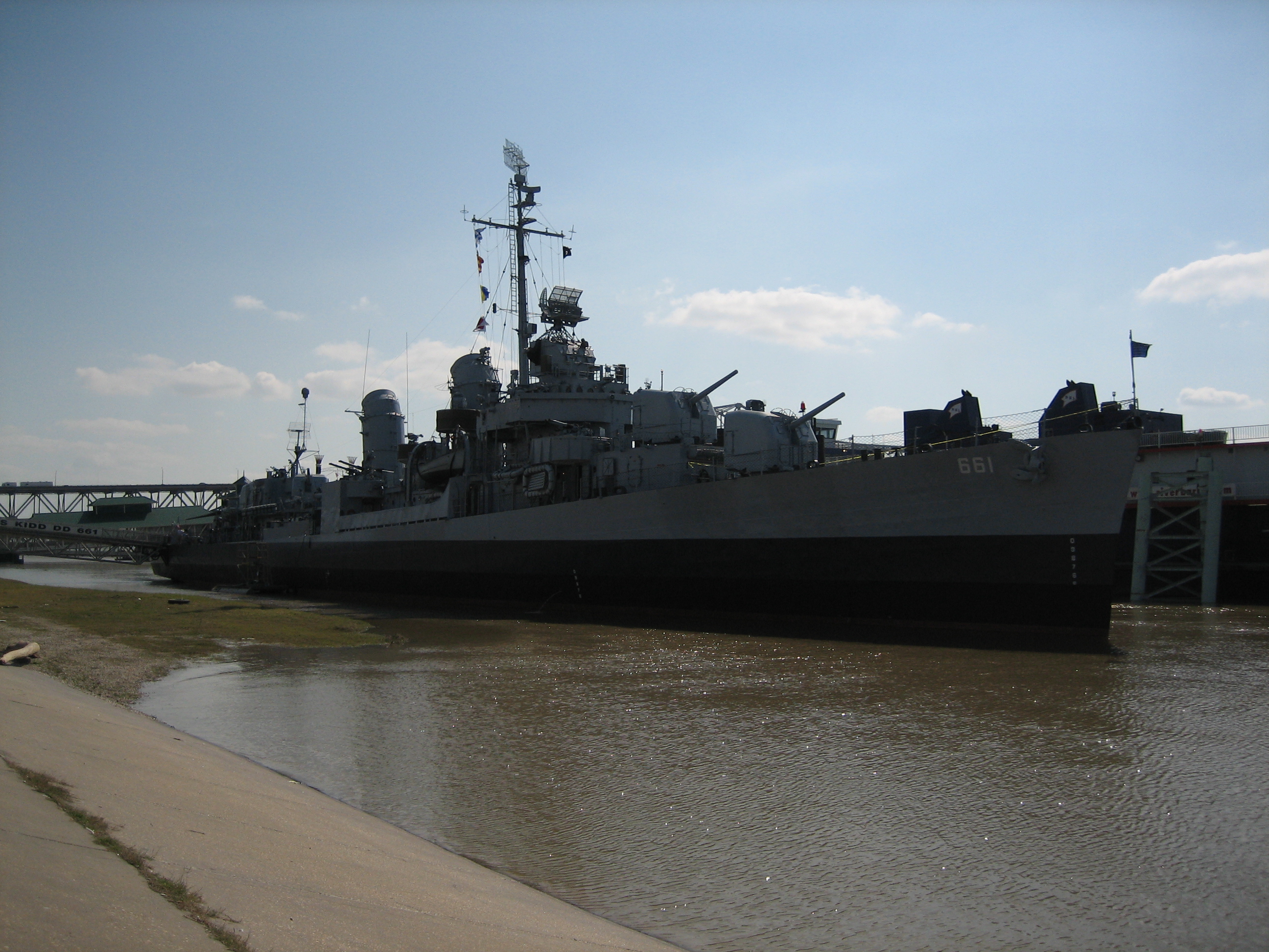
This picture of USS Kidd taken in 1988 shows a blue-ish Haze gray, closer to the upper two drawings. On the other hand this one featuring the same ship in 2004 shows a more standard grey paint scheme on the upper-works instead (yet, she might have been repainted in the meantime, possibly?)

This B&W picture of USS Mobile in 1943 shows a distinctive stark contrast between the two paint shades, closer to the one represented by your third drawing.
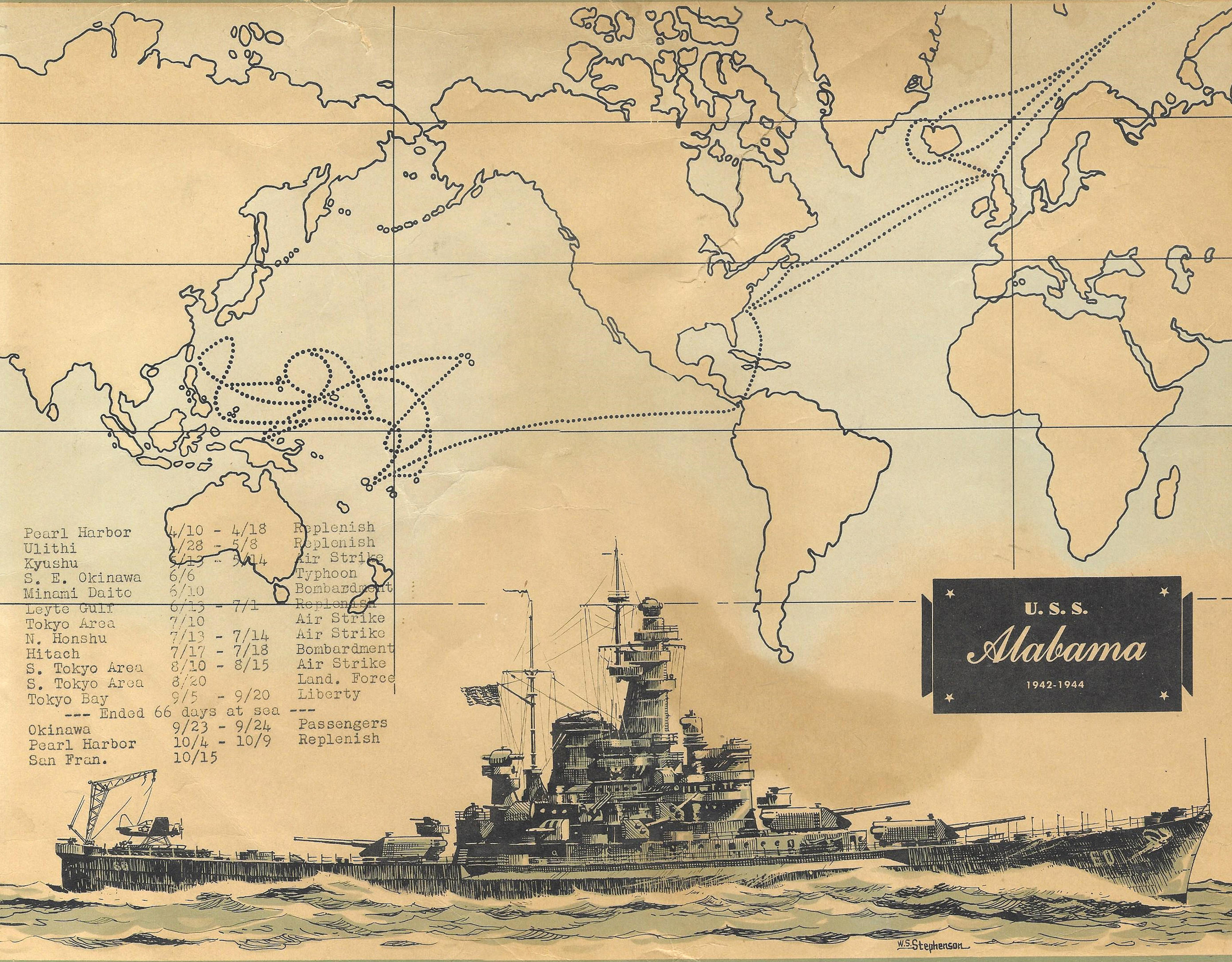
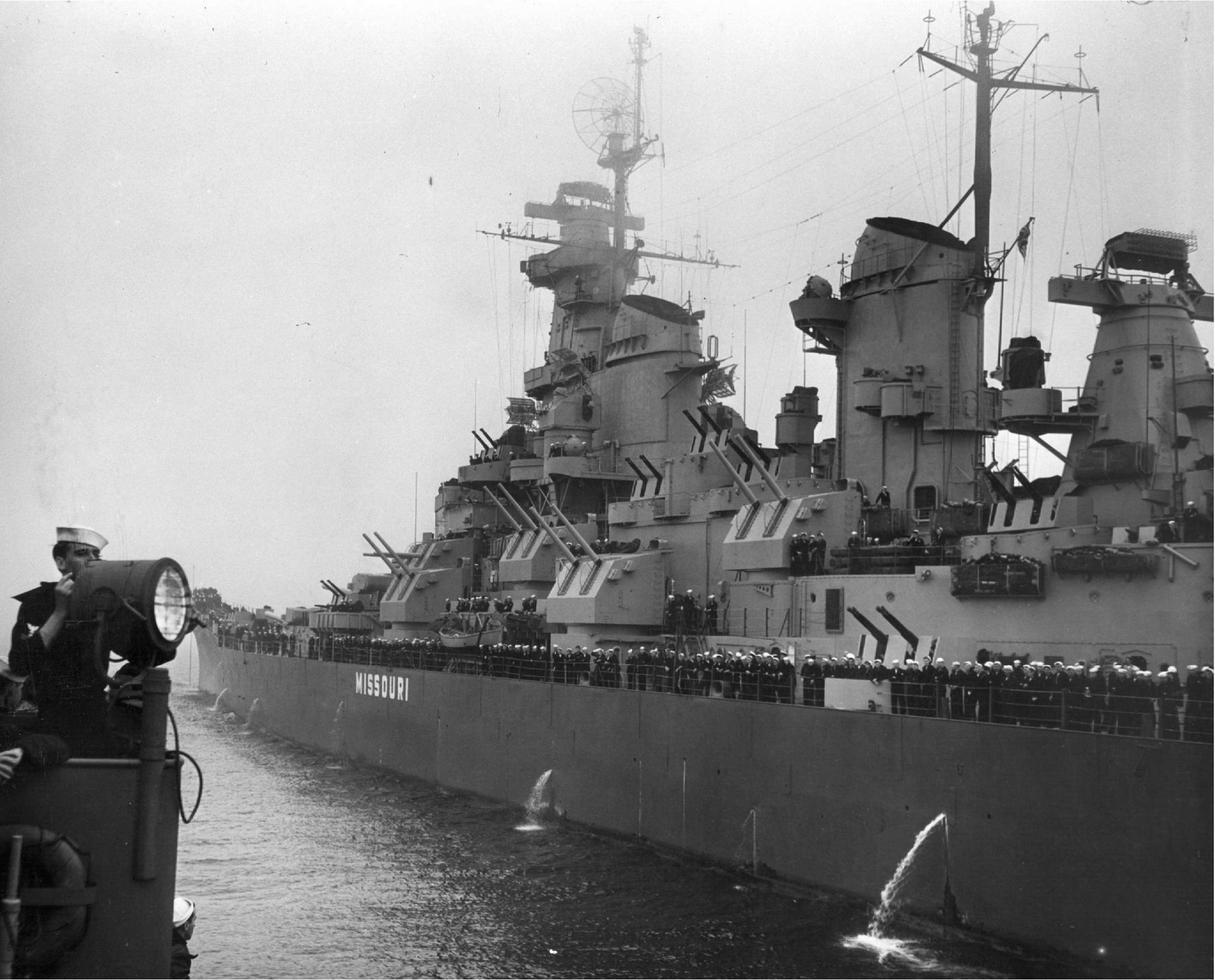
Pics (1) (2) of BB-60 Alabama also shows a similar stark contrast between the Hull and superstructure. The same goes for Missouri.

It is definitely difficult to guess it correctly, Looking at pictures has actually worsened my confusion instead of clearing some doubts.
Aestetically speaking I'd say that the middle drawing looks like a good compromise. The standard Grey one looks good too, but we're all used to see that colour cohexisting with the Measure22 hull. As for the standard Haze Gray, while I still got the feeling of being too dak, the more I look at it, the less it looks wrong, although not enough if compared to the two other shades.

Hope this was not just a futile stream of consciousness.

Author:  heuhen [ June 14th, 2014, 12:34 am ]
Post subject:  Re: USN World War II Components Master Sheet and References

it can be:
- the light of that day...
- quality of camera...
- from what angle the photo have been taken from...
- what part of the year...

... the photo have been taken.

but my bet is on an bluish gray, to simulate the sky...

Author:  Colosseum [ June 14th, 2014, 1:56 am ]
Post subject:  Re: USN World War II Components Master Sheet and References

What I'm going to do is keep the "official" coloration, but also add a second color palette for "Shipbucketized" versions if necessary. I think for 5-H and 5-L it makes sense. It will likely just be the 50% opacity over Shipbucket Grey system for both.

Author:  Karle94 [ June 14th, 2014, 2:18 pm ]
Post subject:  Re: USN World War II Components Master Sheet and References

Also of note, not all ships with Measure 22 1945 revision had a blue hull, some used Navy Gray 5-N, if the Navy Blue 5-NB paint was not available.

Author:  Colosseum [ June 14th, 2014, 3:20 pm ]
Post subject:  Re: USN World War II Components Master Sheet and References

That's not really relevant though - in a black and white picture (which is all we have for determining the contrast), 5-N and 5-NB would look almost exactly the same...

Author:  Karle94 [ June 14th, 2014, 3:24 pm ]
Post subject:  Re: USN World War II Components Master Sheet and References

It would help slighty with the contrast, whilst not that visible, it would help with the impression that the color of the superstructure is lighter. it should also be noted that the measure 22 from 1942 and 1945 are not identical, as the 1945 was revised with a new type of gray.

Author:  TimothyC [ June 14th, 2014, 6:50 pm ]
Post subject:  Re: USN World War II Components Master Sheet and References

Might I also suggest that a color-corrected US flag be used:

[ img ]

I pulled the correct colors off of a pantone color sheet.

Author:  Colosseum [ June 16th, 2014, 11:04 pm ]
Post subject:  Re: USN World War II Components Master Sheet and References

Karle94 wrote:
It would help slighty with the contrast, whilst not that visible, it would help with the impression that the color of the superstructure is lighter. it should also be noted that the measure 22 from 1942 and 1945 are not identical, as the 1945 was revised with a new type of gray.
The trouble of course lies with determining which colors were actually used for what ships - Measure 22 remained "Measure 22", even with the introduction of the new gray colors. What's even better is that issuance of the new gray paints didn't reach every ship - so it's very difficult to determine what ships were wearing what versions of Measure 22 during which time periods...

Revised camouflage color sheet to show "shipbucket corrected" color swatches shortly to come...

Page 4 of 8 All times are UTC
Powered by phpBB® Forum Software © phpBB Limited
https://www.phpbb.com/